
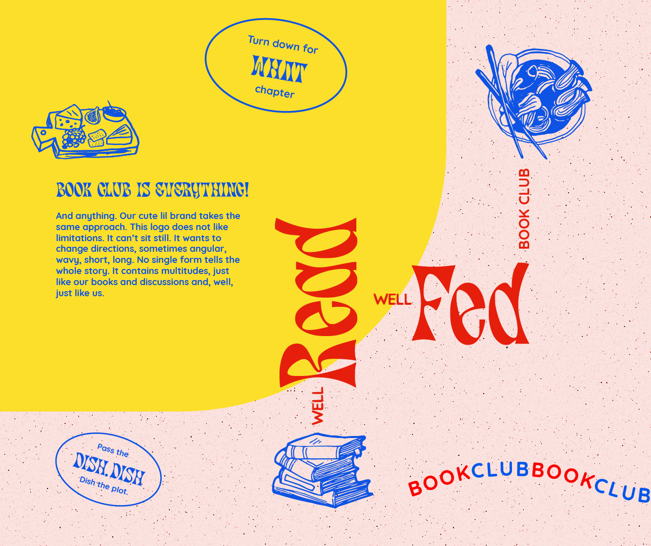
Well Read Well Fed Book Club
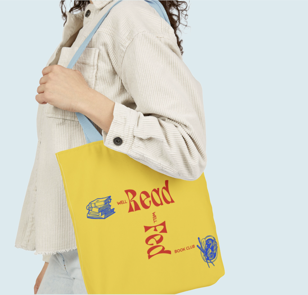
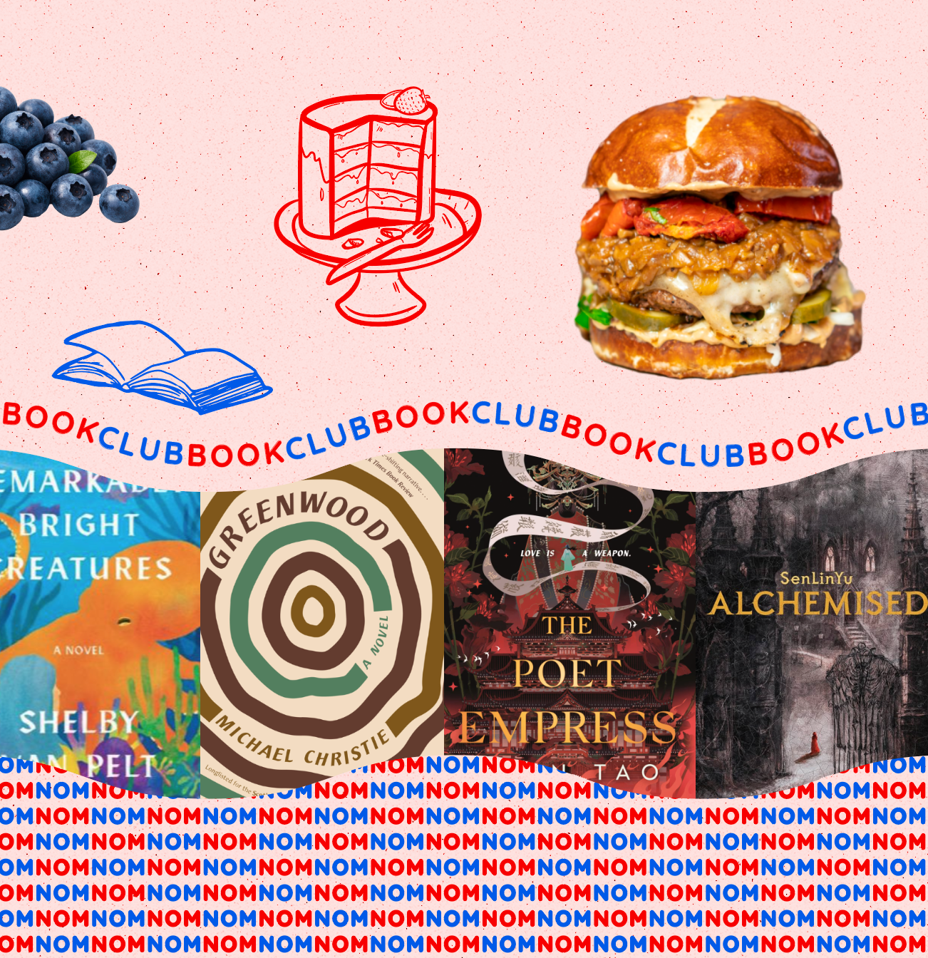
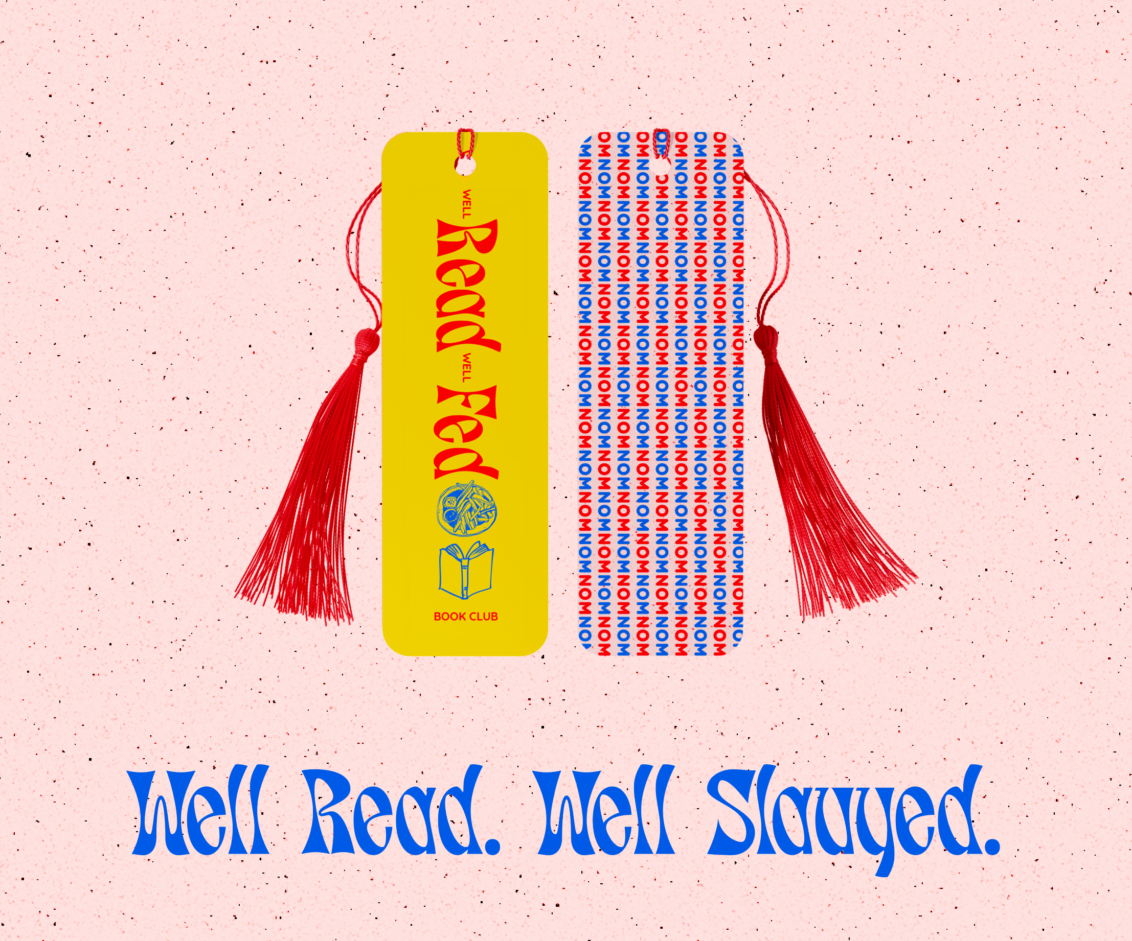
A full brand identity for a book club that takes food for thought literally. Logo system, illustrations, type selection, color palette, and fun merch. Book club is everything! And anything.
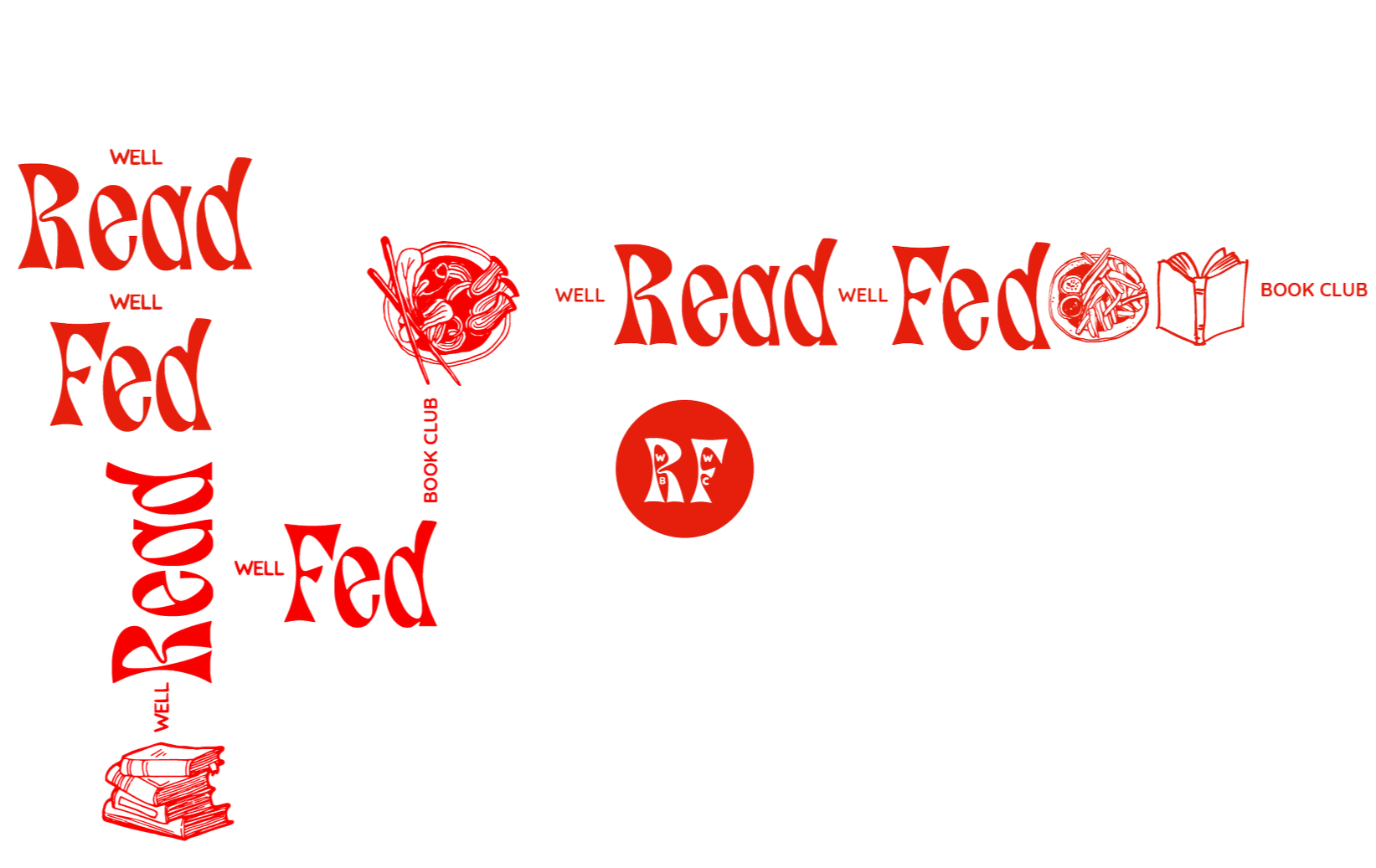
This logo that can’t sit still, and that’s on purpose.
-
A club filled with unique characters who bond over books and food.
-
Brand Designer as well as a proud member of the club.
-
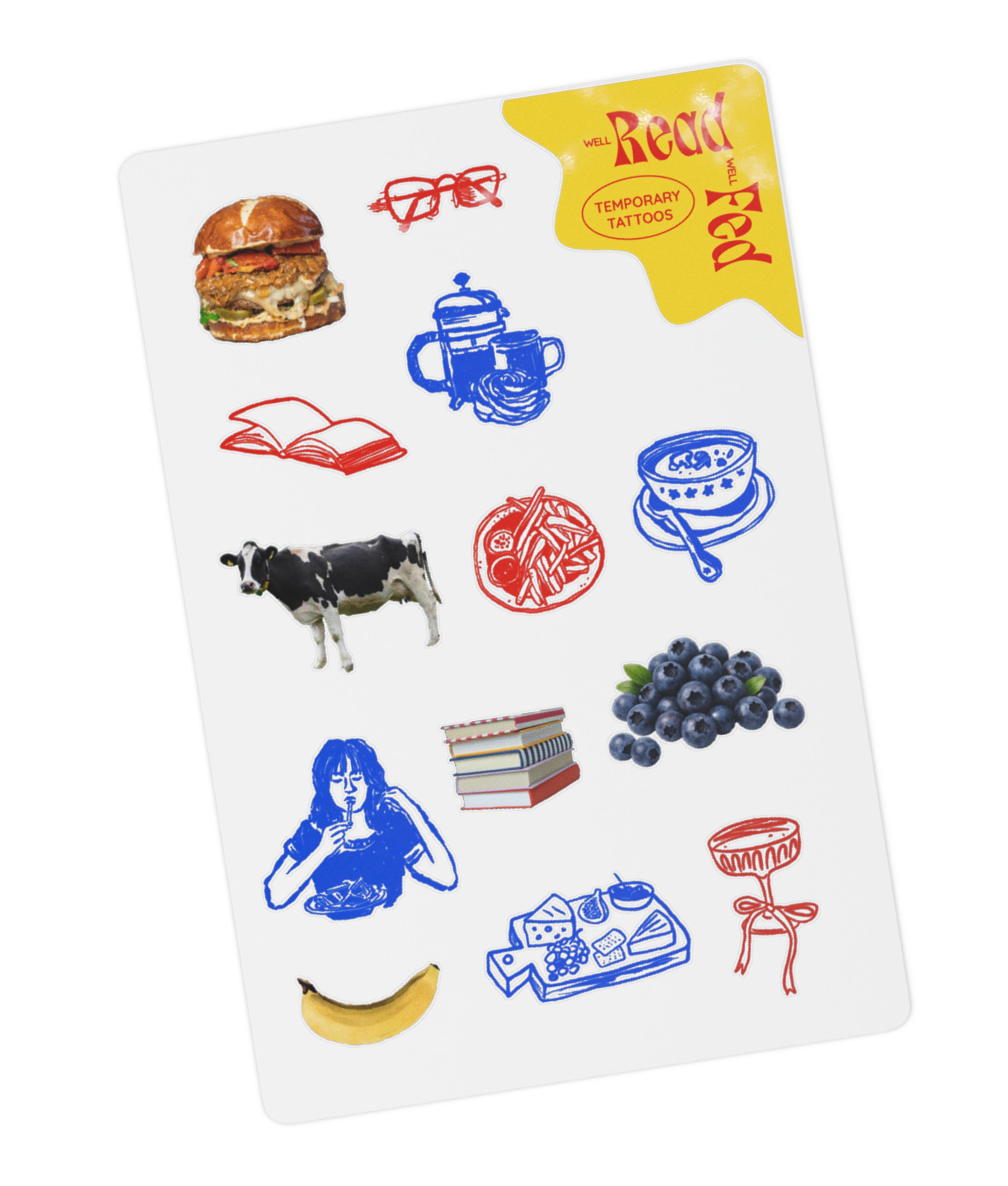
Logo design, brand identity, and lots and lots of super fun merch.
The concept
This brand needed to feel like book club gathering: a little chaotic, very warm, full of opinions and conversational twists and turns, and, for this club, yummy food. Our cute lil brand takes the same approach. The logo does not like limitations. It can’t sit still. It wants to change directions or move around the page. It is sometimes wavy, or short, or long. No single form tells the whole story. It contains multitudes, just like our books and discussions and, well, just like us.

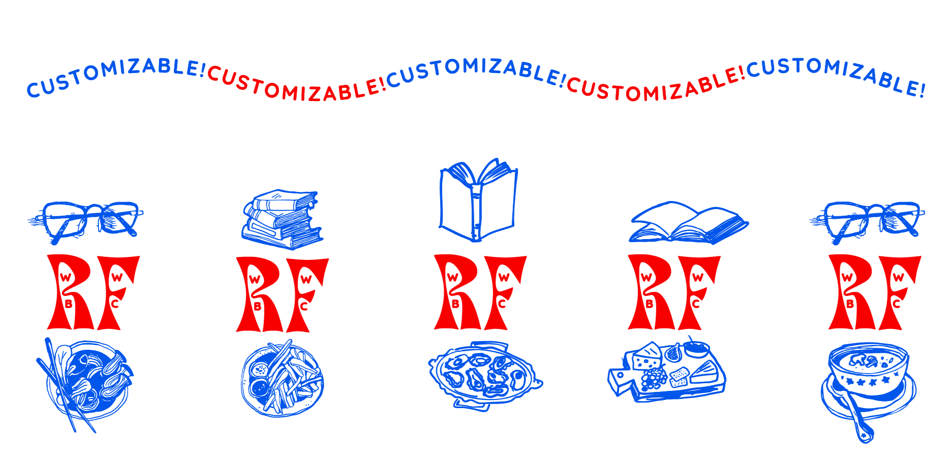
Favorite food? Book + Coffee = Joy? Are you a reader who needs readers? We are individuals, and our book club mark reflects that.
Type & color
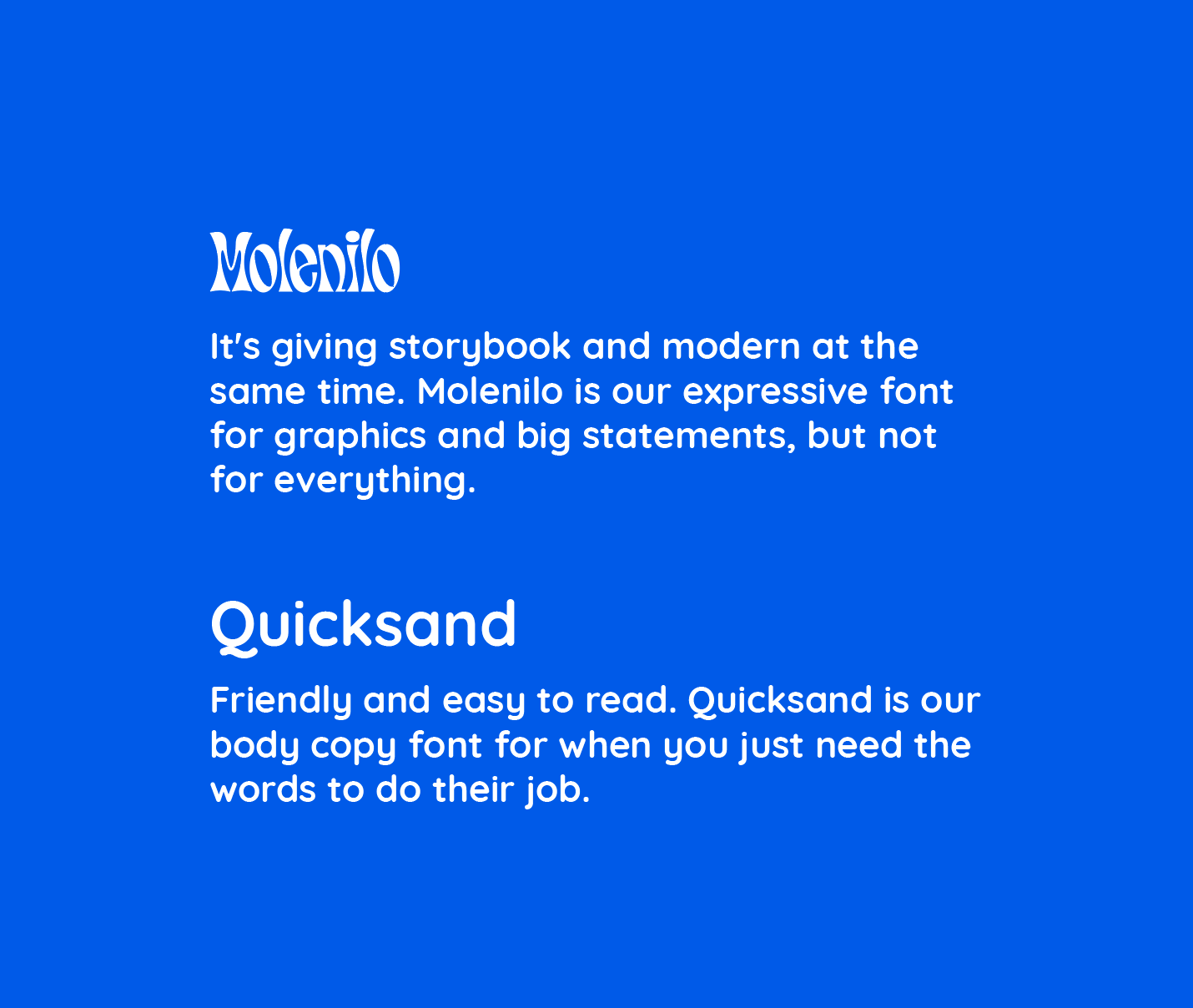
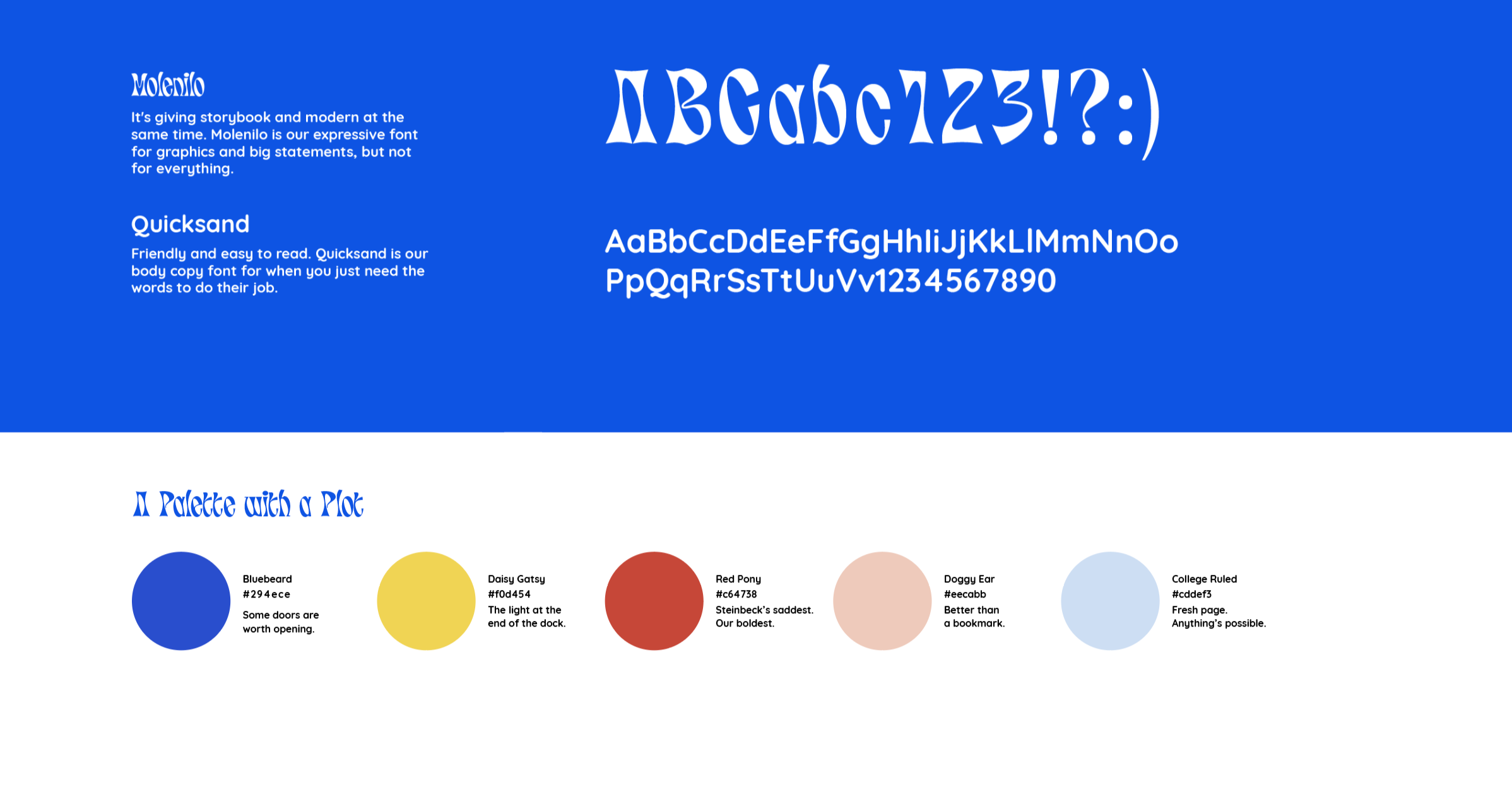
Two typefaces. Five colors. Endless stories to enjoy.
Clubbin’ for grownups.
The brand for the book club that feeds you in mind, body, and soul.
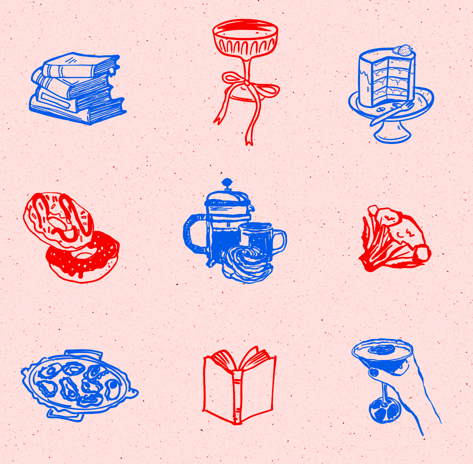
A full identity system for a book club that takes both halves of its name seriously — the reading and the eating, the opinions and the snacks, the type and the illustrations. Built to feel like the best meeting you've ever been to.
The brief was simple: make it feel like the best book club ever because that’s what they are. Warm and inviting. Bold and opinionated. Readers with opinions, snacks with intention, and a group chat that never really goes quiet between sessions. That is who the Well Fed Well Read Book Club is.
The result is a full visual identity: a logo system, illustration library, color palette, type guide, and merch. One meeting at a time, one great book at a time, one very good dish at a time.