Banfield Pet Hospital
Banfield Pet Hospital isn't a single project — it's a design relationship. As a contract designer embedded in their team more than once, I worked across illustration, campaign design, social media systems, clinic signage, email marketing, and branded collateral. Every piece driven by the same conviction: pets deserve the best care, and so do the people who love them.
A full brand partnership built on love for pets.
-
Banfield Pet Hospital
-
Contract Designer
-
Branding, Campaigns, Print, Digital
Reaching pet parents at a tender moment.
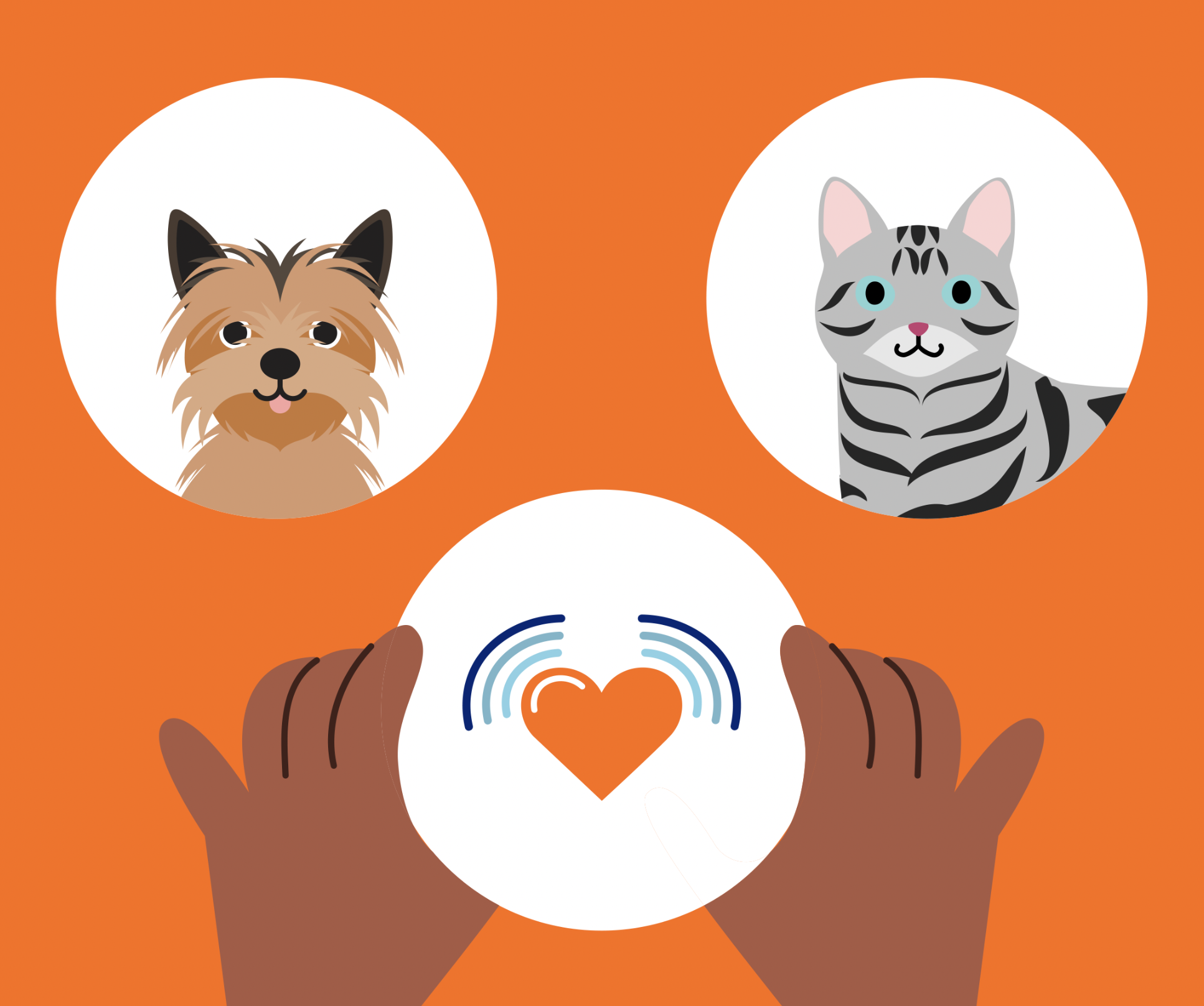
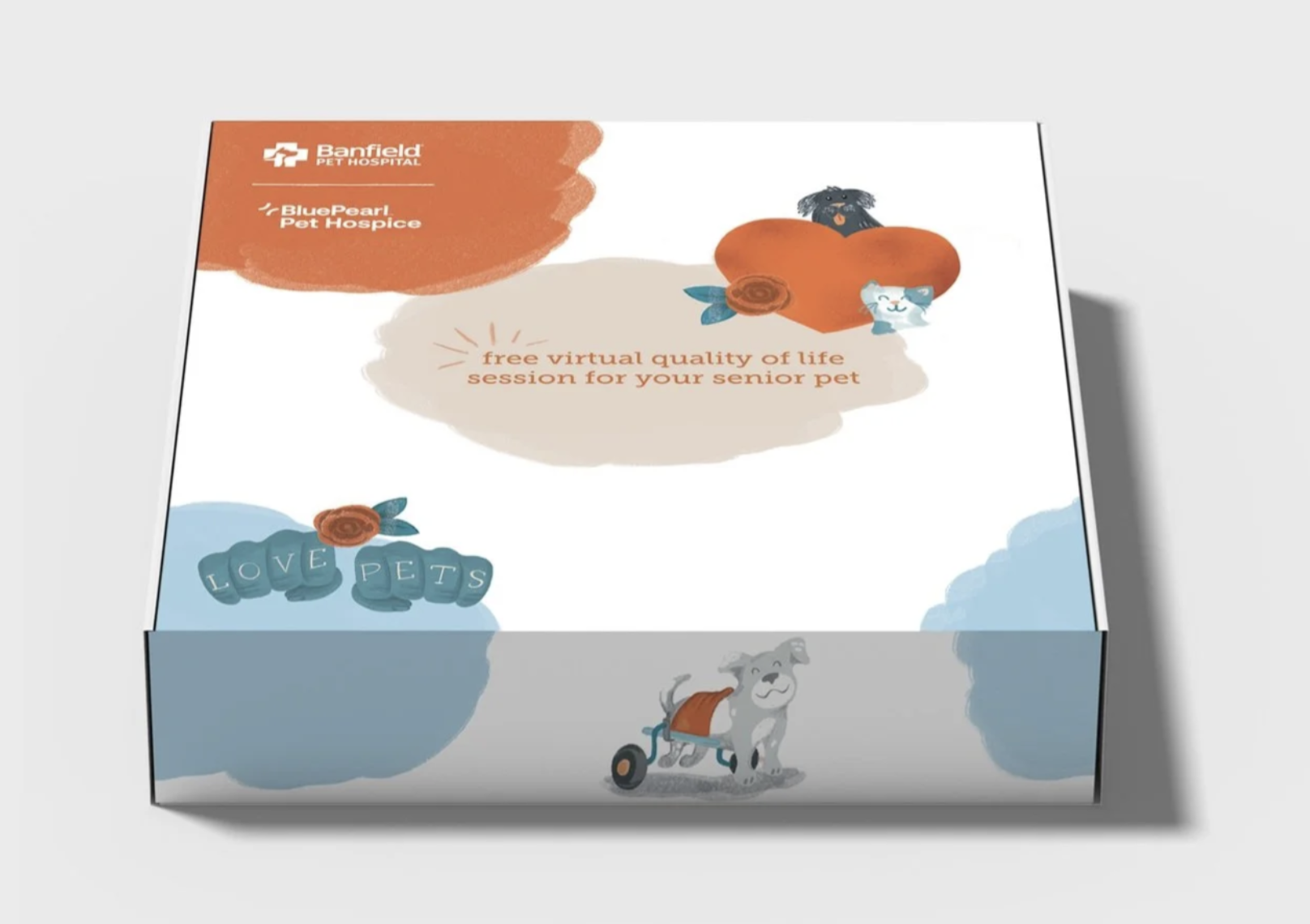
Banfield's Virtual Quality of Life program invited pet parents of senior animals into an online advising session — a gentle, expert conversation about what their pet's later years could look like. The campaign needed to lead with warmth, not clinical distance.
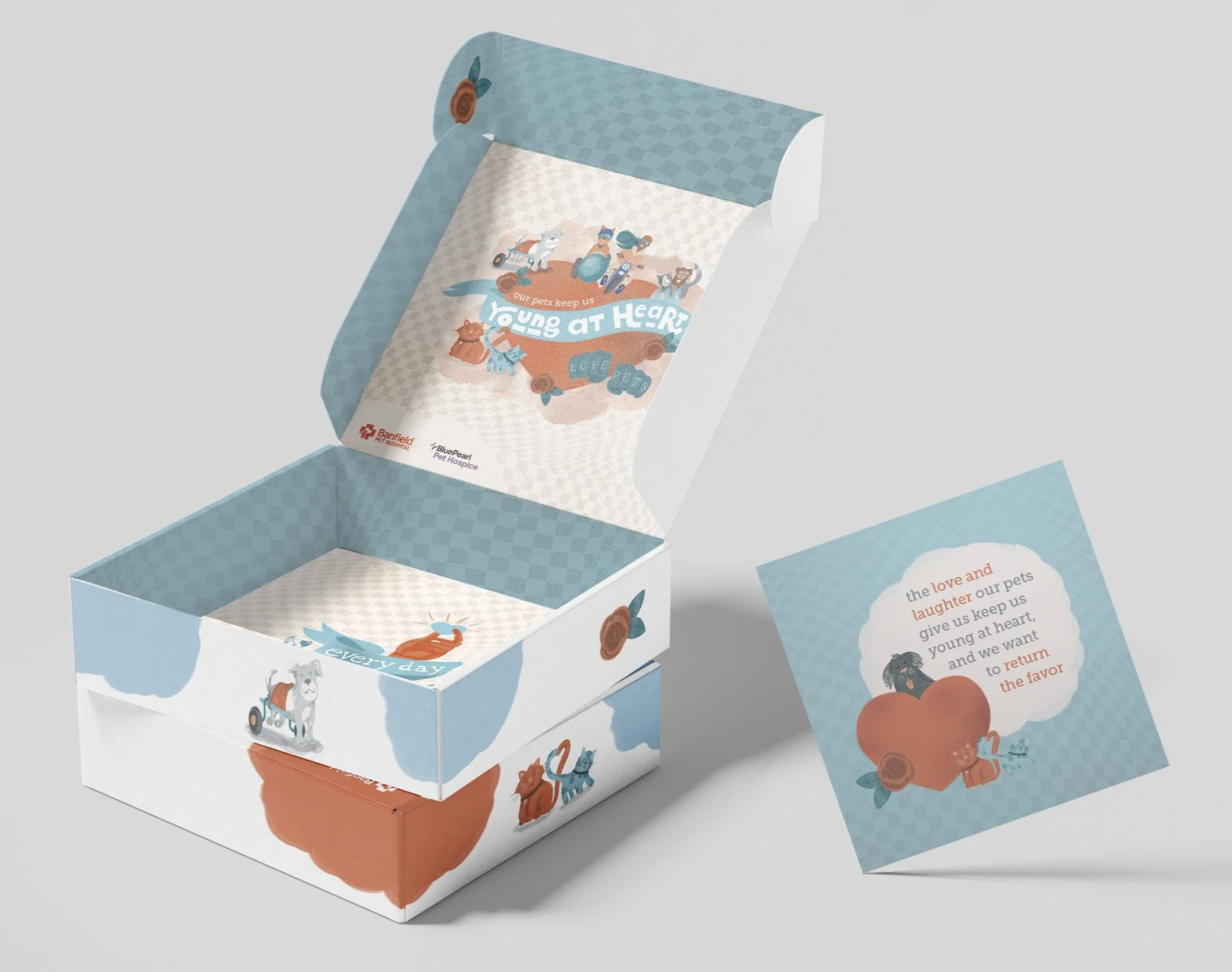
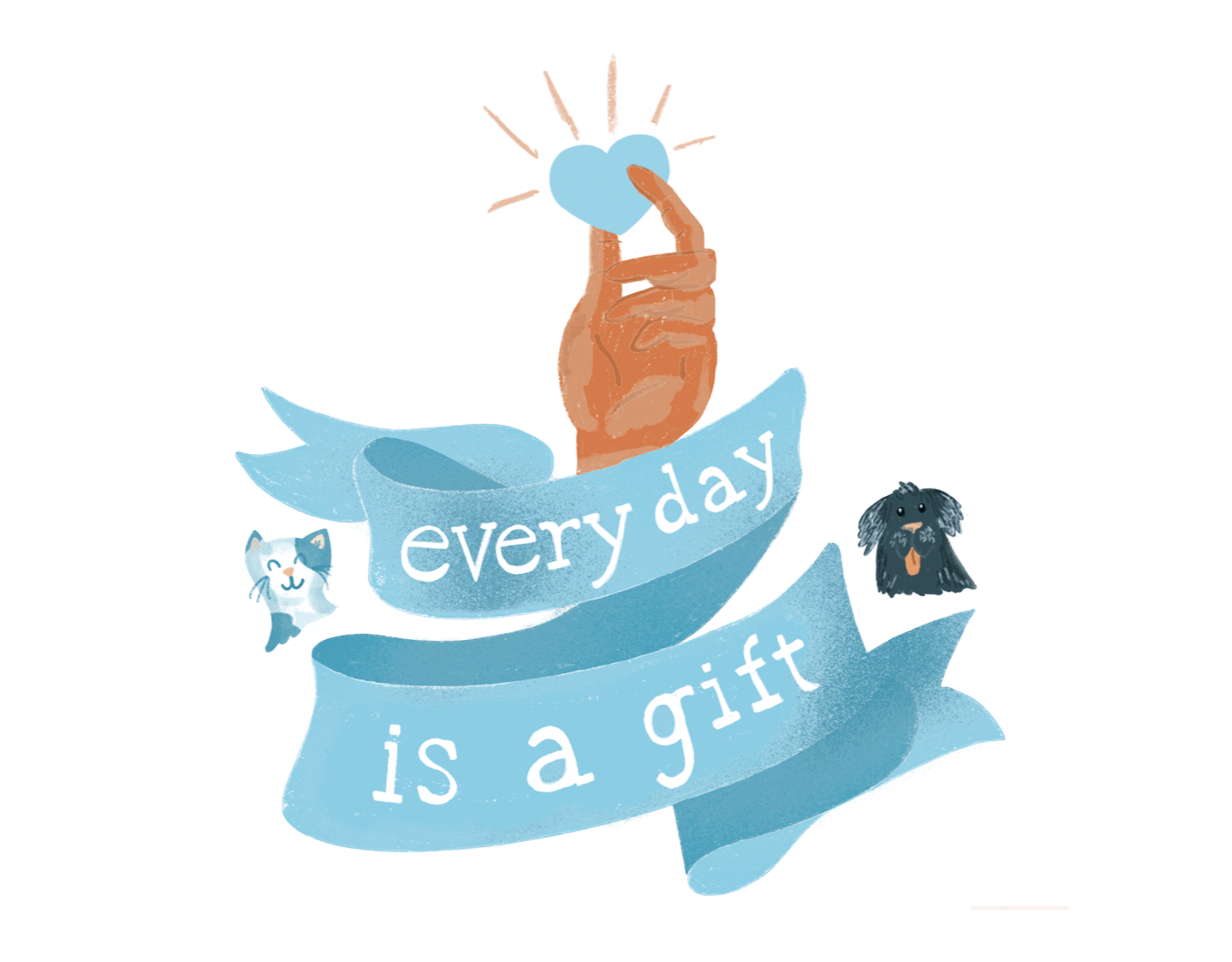
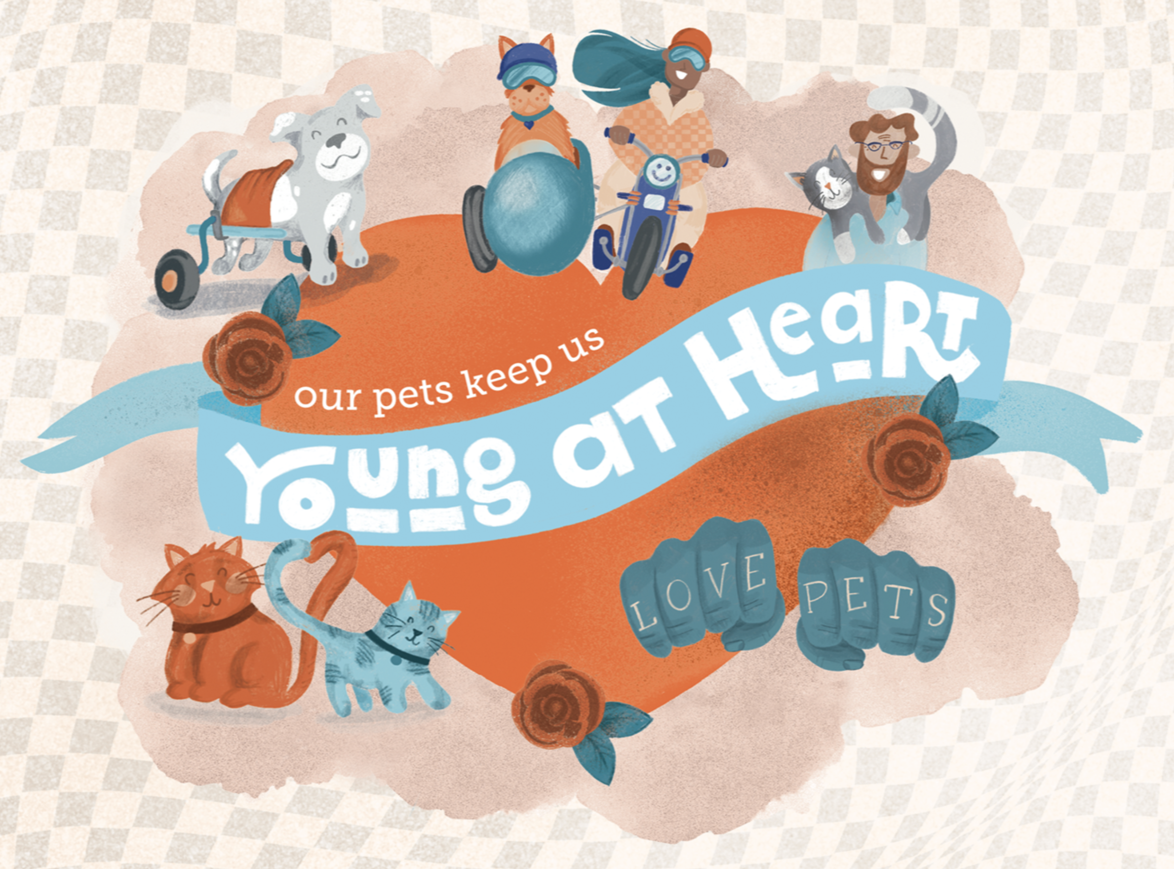
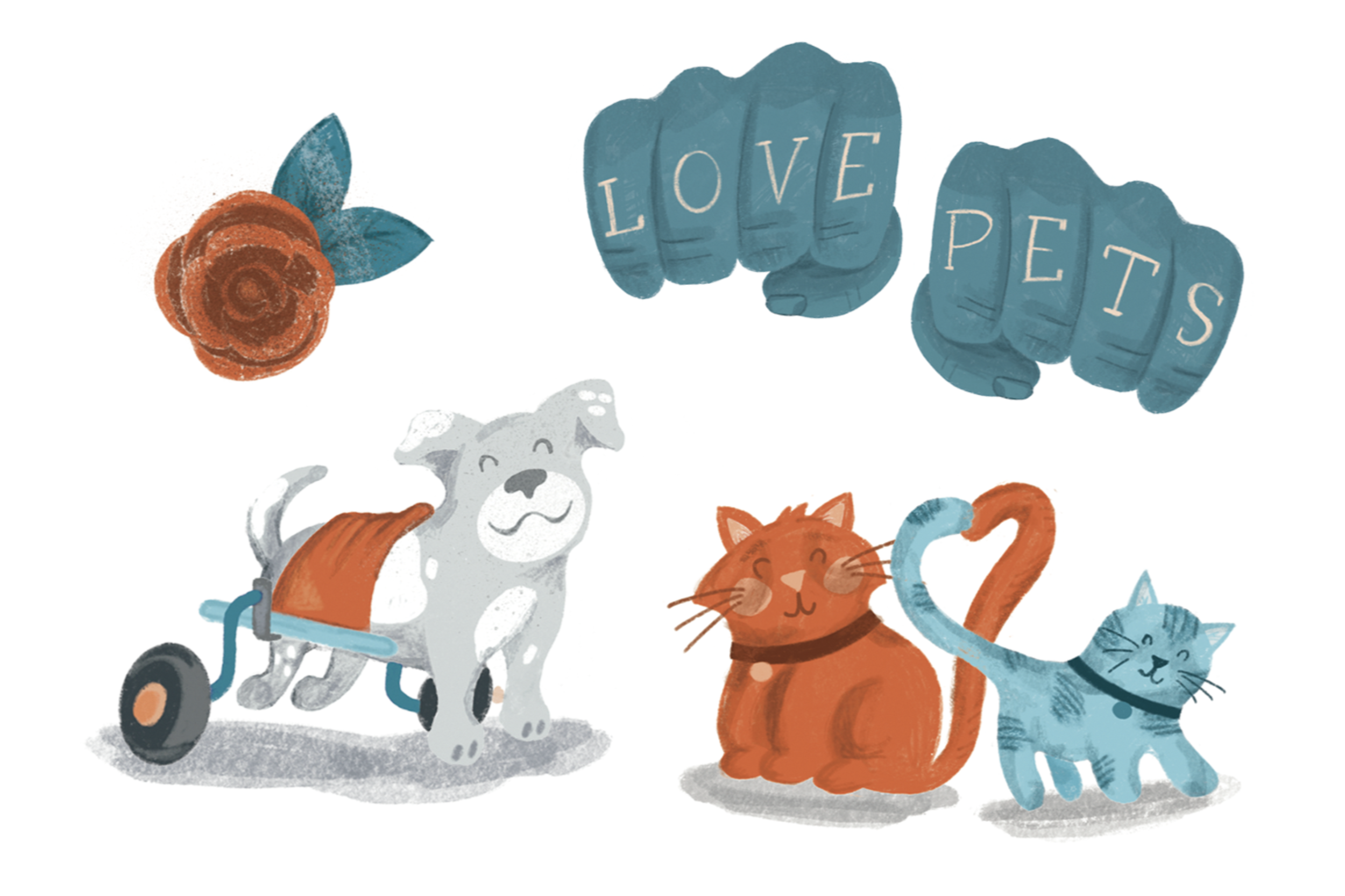
The "Young at Heart" initiative became a full multi-channel campaign: premium mailed gift box, postcard, emails, and a landing page, all anchored by original illustration I created from scratch. The characters had to be charming enough for a doorstep, flexible enough for a website, and emotionally resonant enough to connect with someone who loves their aging pet.
01
Original illustration characters designed to carry the full campaign
Premium gift box — designed to delight in both closed and open states
Postcard, email suite, and VQOL landing page
Consistent illustration voice across every format and scale
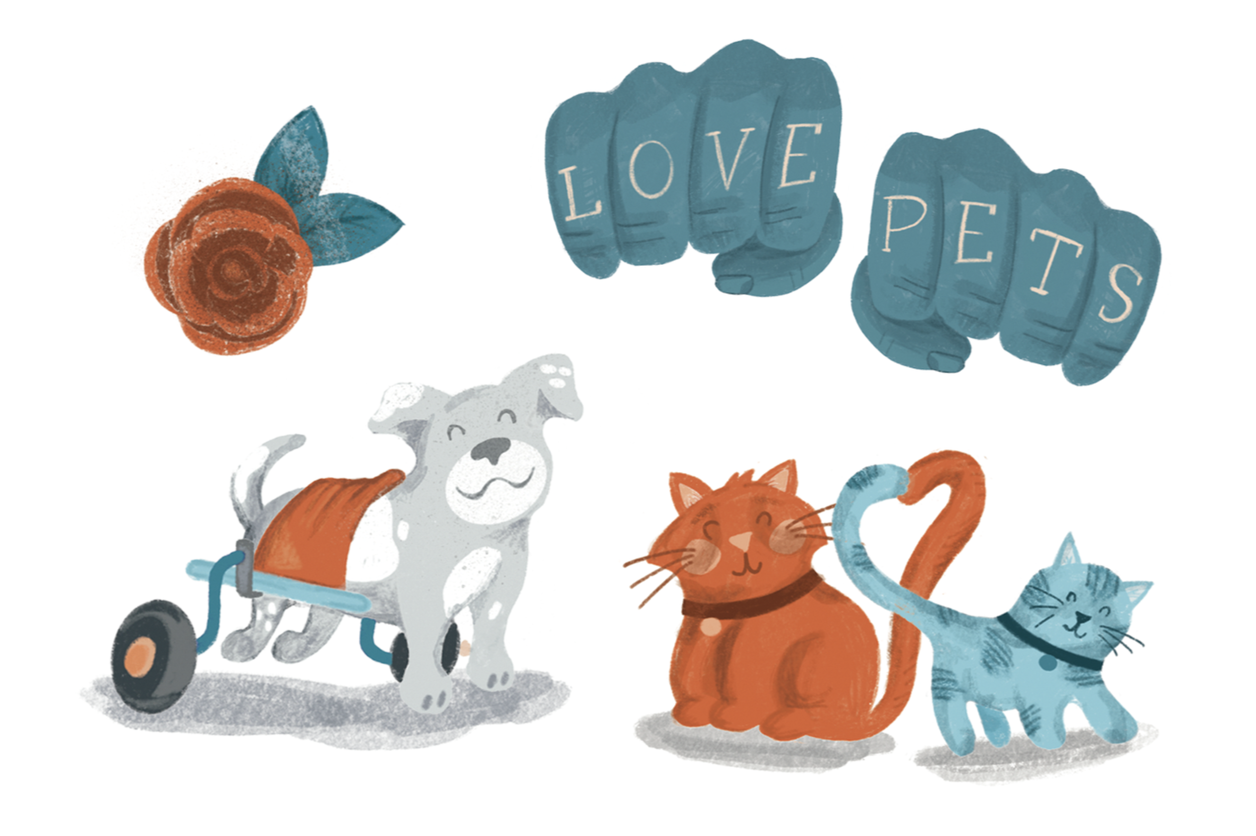
Senior pets deserve celebration, not just concern. "Young at Heart" gave the campaign its tone which was emphasis on vitality and the richness of life with an older animal. Every design decision served that feeling rather than the clinical reality underneath it.
02
Three audiences.
Three visual voices.
Social media for Banfield isn't one system — it's several. Blog content, clinic announcements, and internal culture campaigns each need their own visual language while staying unmistakably part of the same family. The discipline is knowing when to stay within the brand's orange and when to break into a completely different palette for something like Pride, without ever losing what makes Banfield feel like Banfield.
CLINIC ANNOUNCEMENTS SOCIAL MEDIA
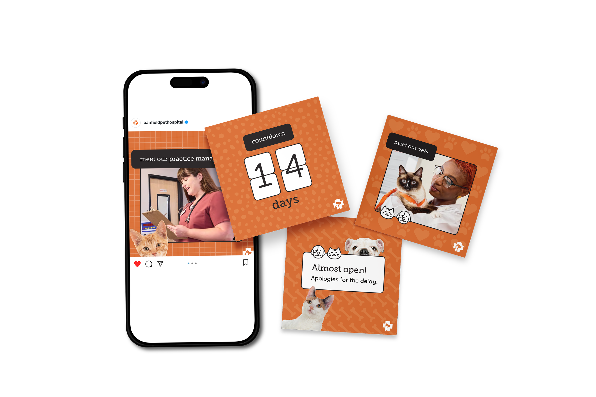
A complete launch sequence for new clinic openings: countdown timer tile, "Almost open — apologies for the delay," "Now open" with address and hours, "Meet our vets," and "Meet our vet techs" — all in a cohesive orange-patterned system. This sequence does real operational work: it manages patient expectations, introduces the clinical team, and builds local community awareness across the full launch period.
BLOG POST SOCIAL MEDIA
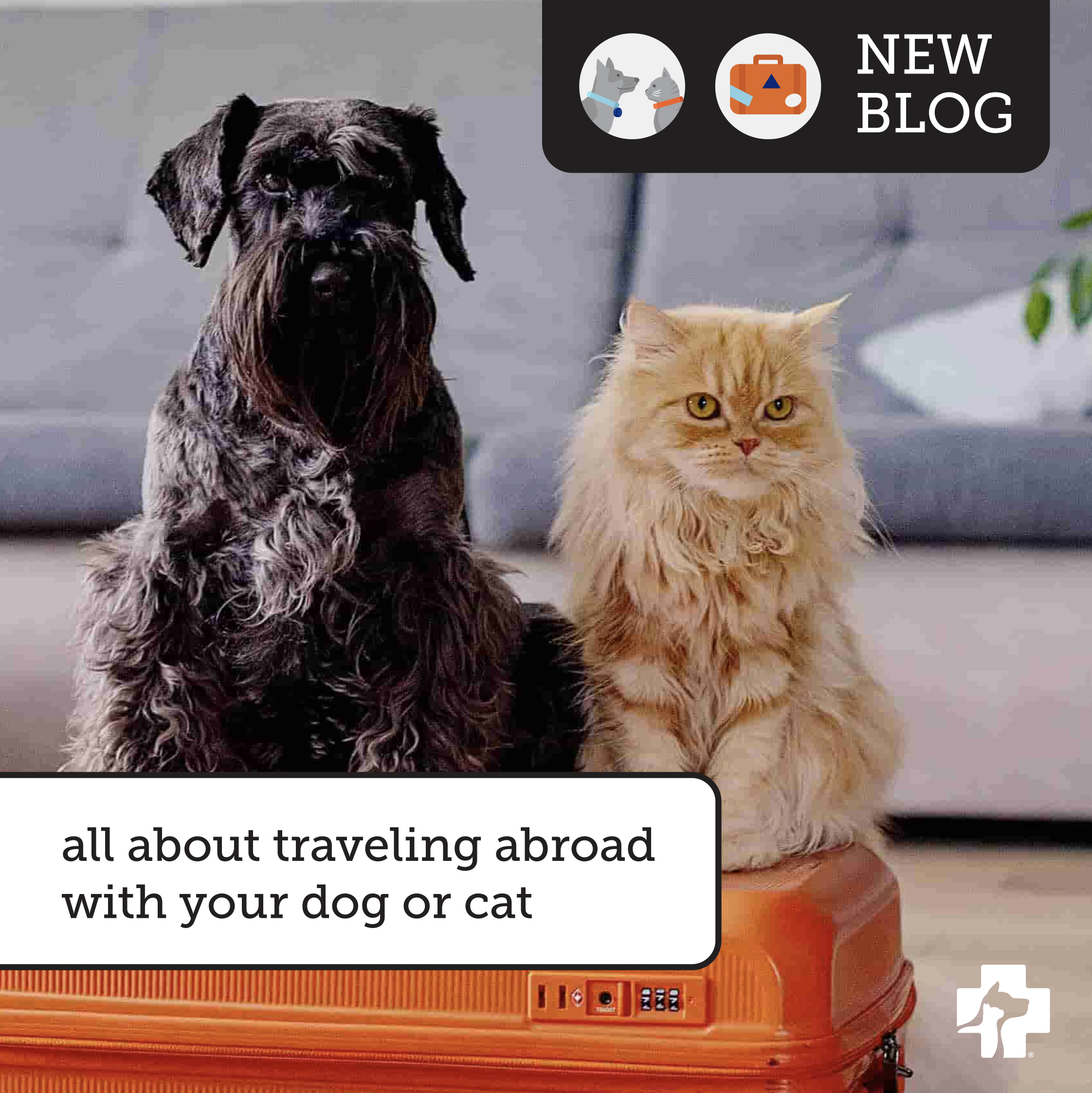
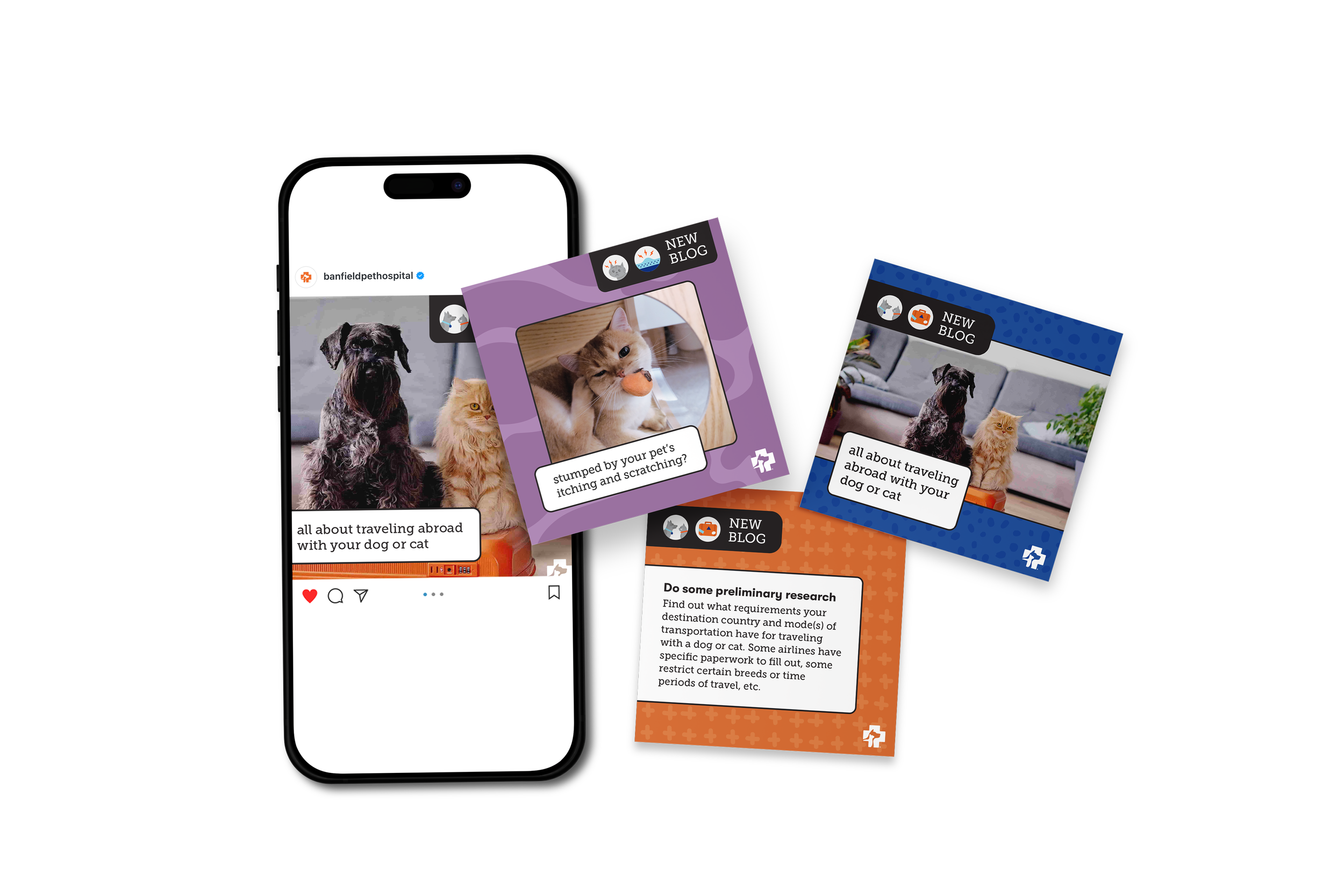
A multi-format system across square and story dimensions in three colorways — orange, purple, and blue. Each tile adapts the same template to a different content type: hero image with caption, text-forward blog excerpt with tips, and "Read More" CTA cards. Topics include traveling abroad with pets and managing itching and scratching. All practical, expert content made visually engaging and shareable at any size.
PRIDE SOCIAL MEDIA — INTERNAL CULTURE CAMPAIGN
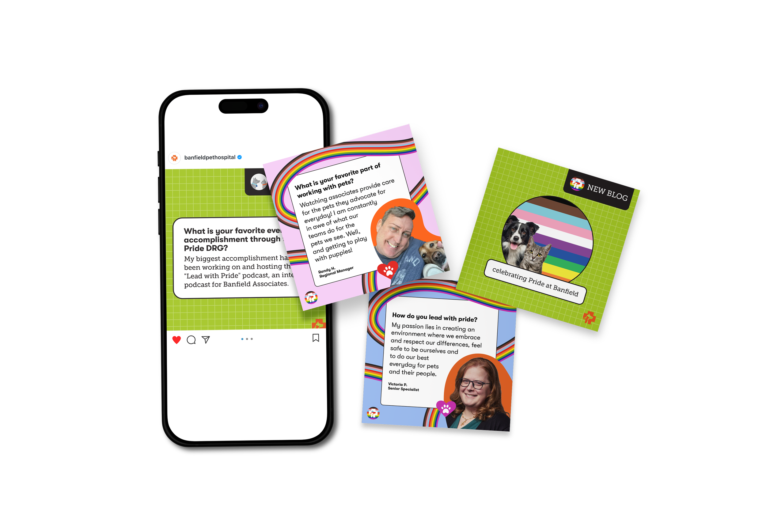
The Pride campaign called for a completely different visual voice with lime green, rainbow arcs, and a grid-based background pattern. It celebrated real Banfield associates answering questions like "How do you lead with pride?" and "What is your favorite accomplishment through the Pride DRG?" This is employer brand work: celebrating the people inside Banfield, not just the services they offer. The orange circle crop gives every associate portrait a bold, consistent frame that holds the system together across very different faces and settings.
The details are where a brand comes to life.
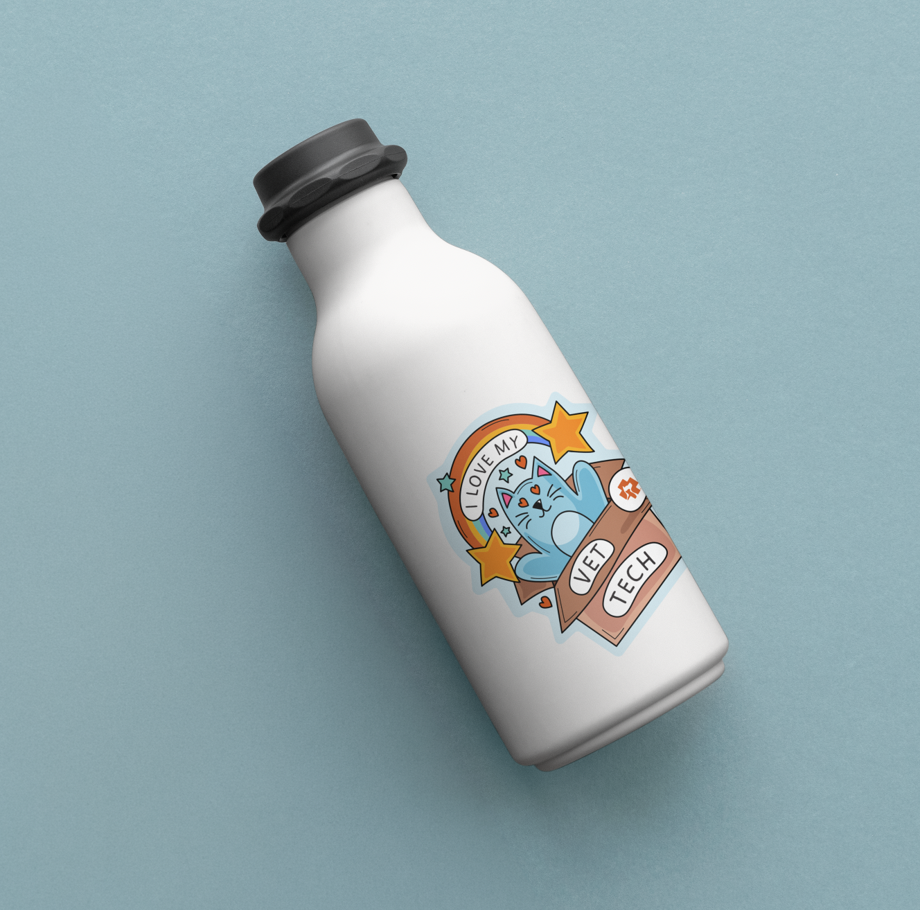
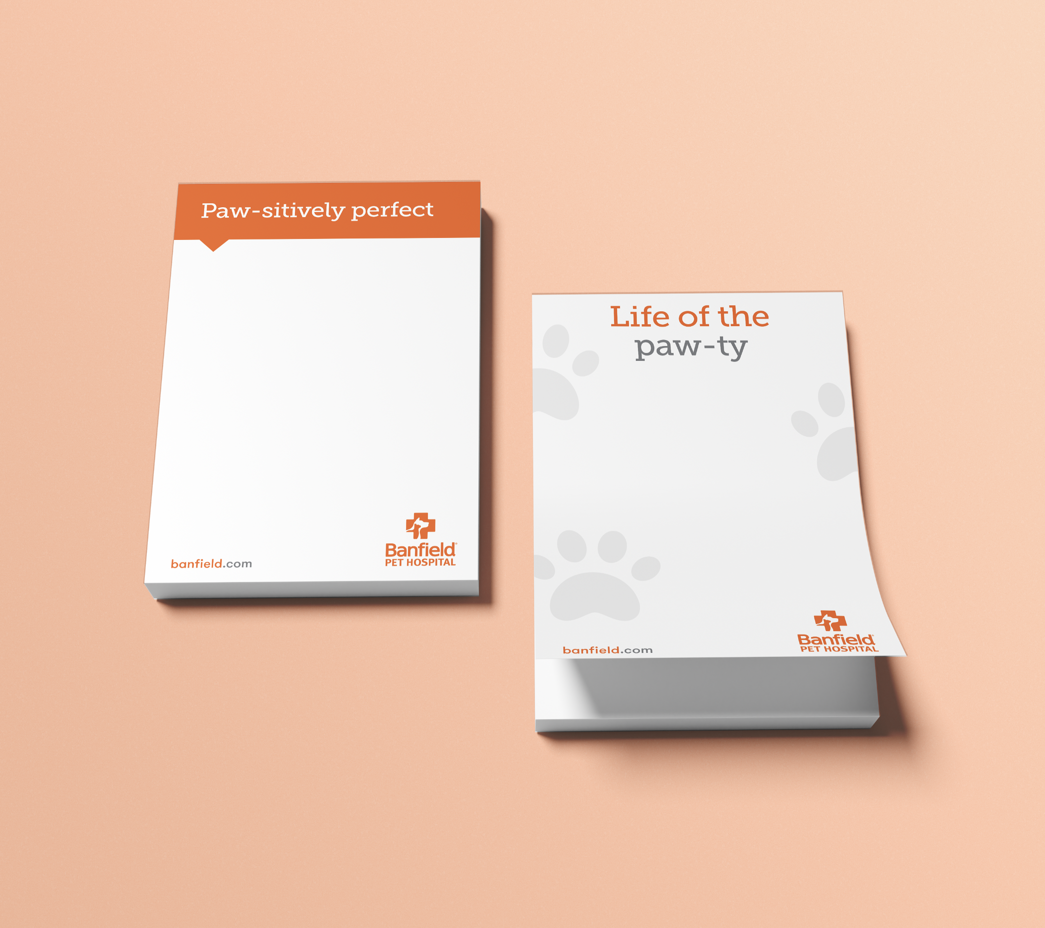
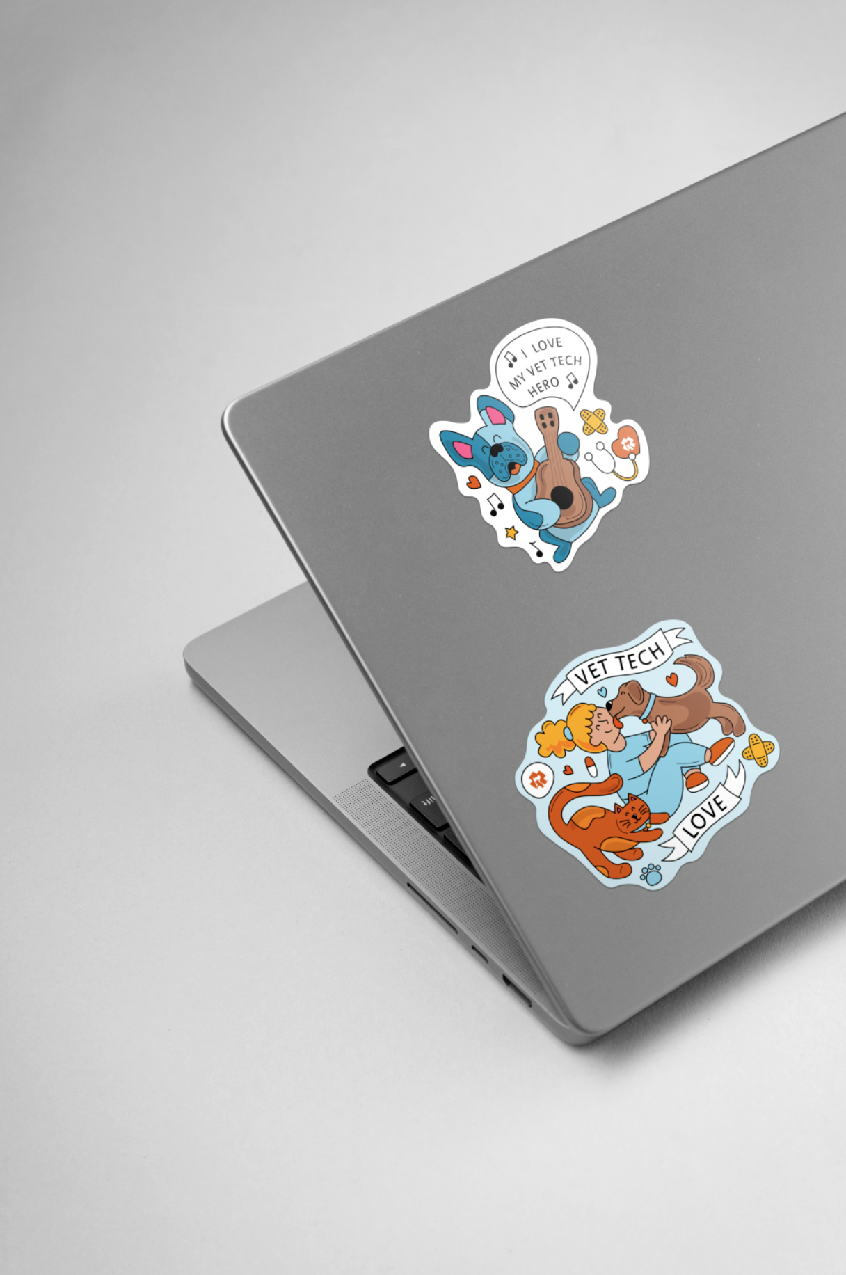
The details are where a brand either holds together or falls apart. Stickers are are the pieces that associates carry around, stick on water bottles or laptops. And branded notepad paper shows up everywhere. This is the brand made personal and portable.
The Vet Tech sticker series features three illustrated designs across three characters, each celebrating the people who do the hands-on work of caring for animals every day. "I Love My Vet Tech," "Vet Tech Love," and "I Love My Vet Tech Hero" are distinct in style but united by the same warmth and energy — and the same love of a good pun.
The notepad series was simple, but our copywriter’s line did the real work with "Paw-sitively perfect," "Life of the paw-ty." Evidence of the brand's playfulness on a functional object. A notepad someone actually wants to use is a marketing piece that markets itself every single day.
03